Creative Studio.
Graphic Design & Art Direction
︎︎︎

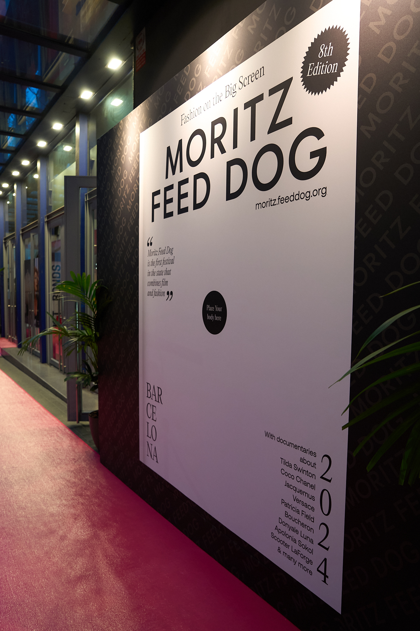
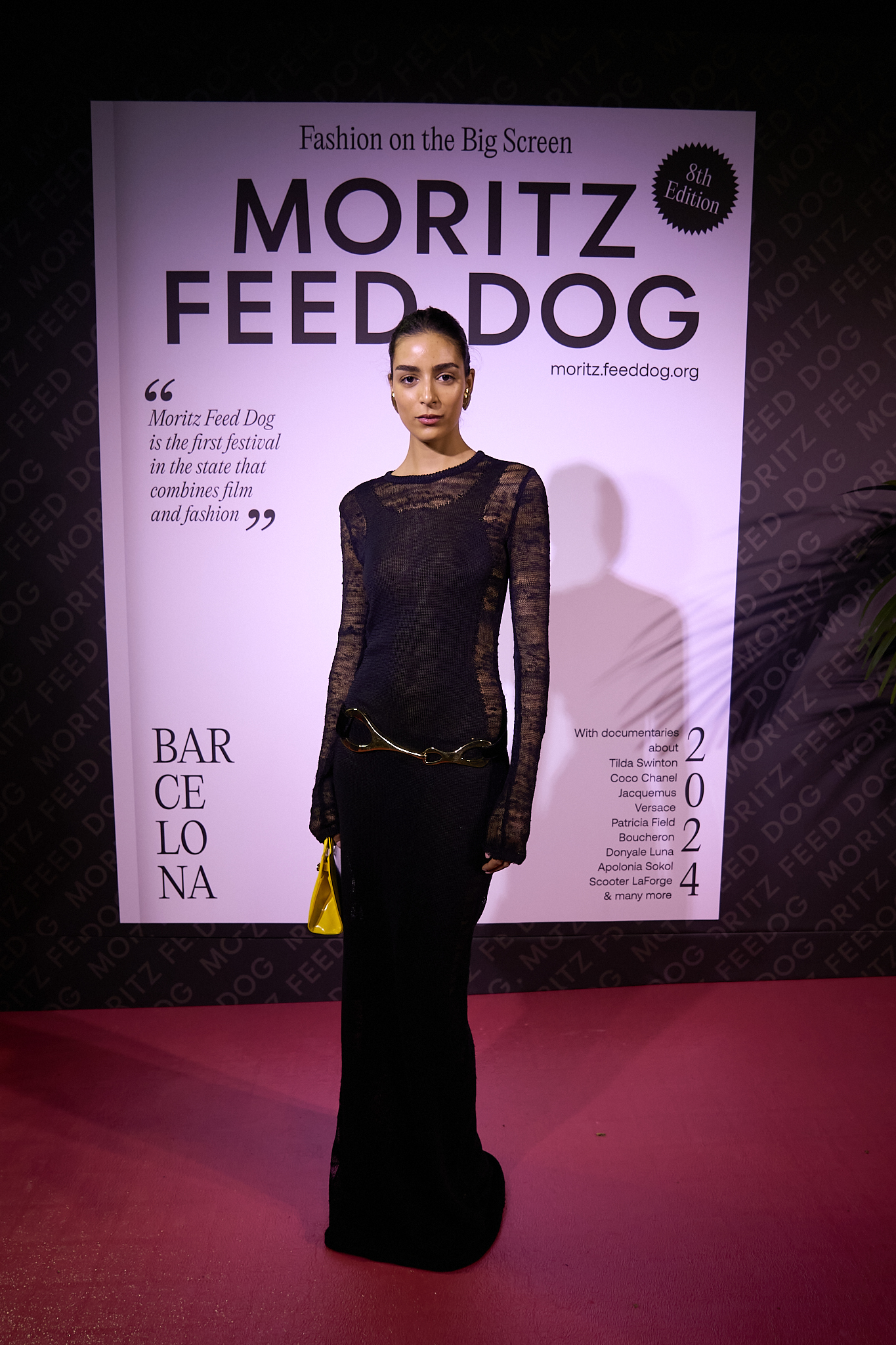
Moritz Feed Dog 2024
Client: Moritz Feed Dog Services: Rebranding | Festival | Identity | Art Direction | Graphic Design | Social Media | Motion


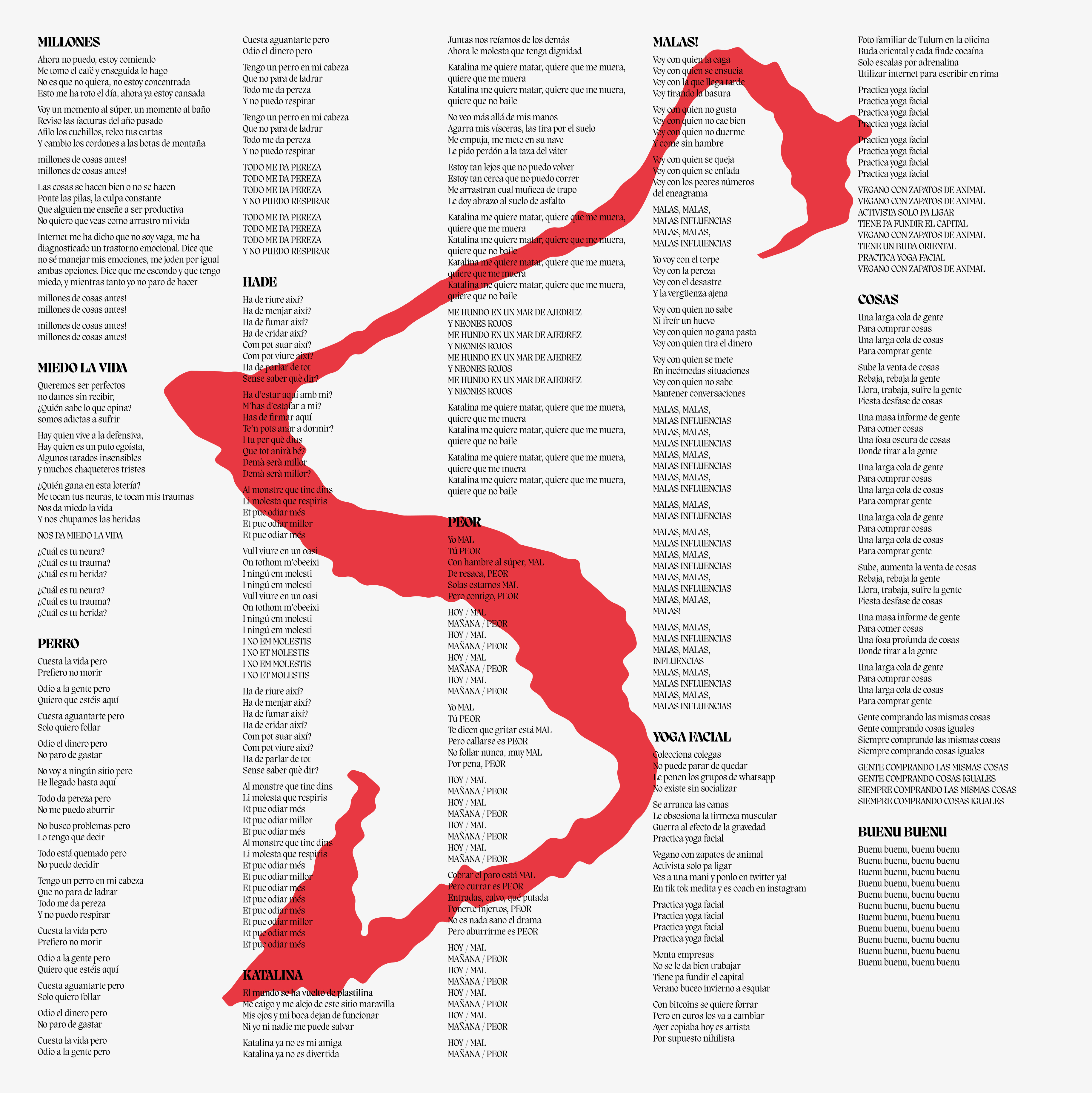
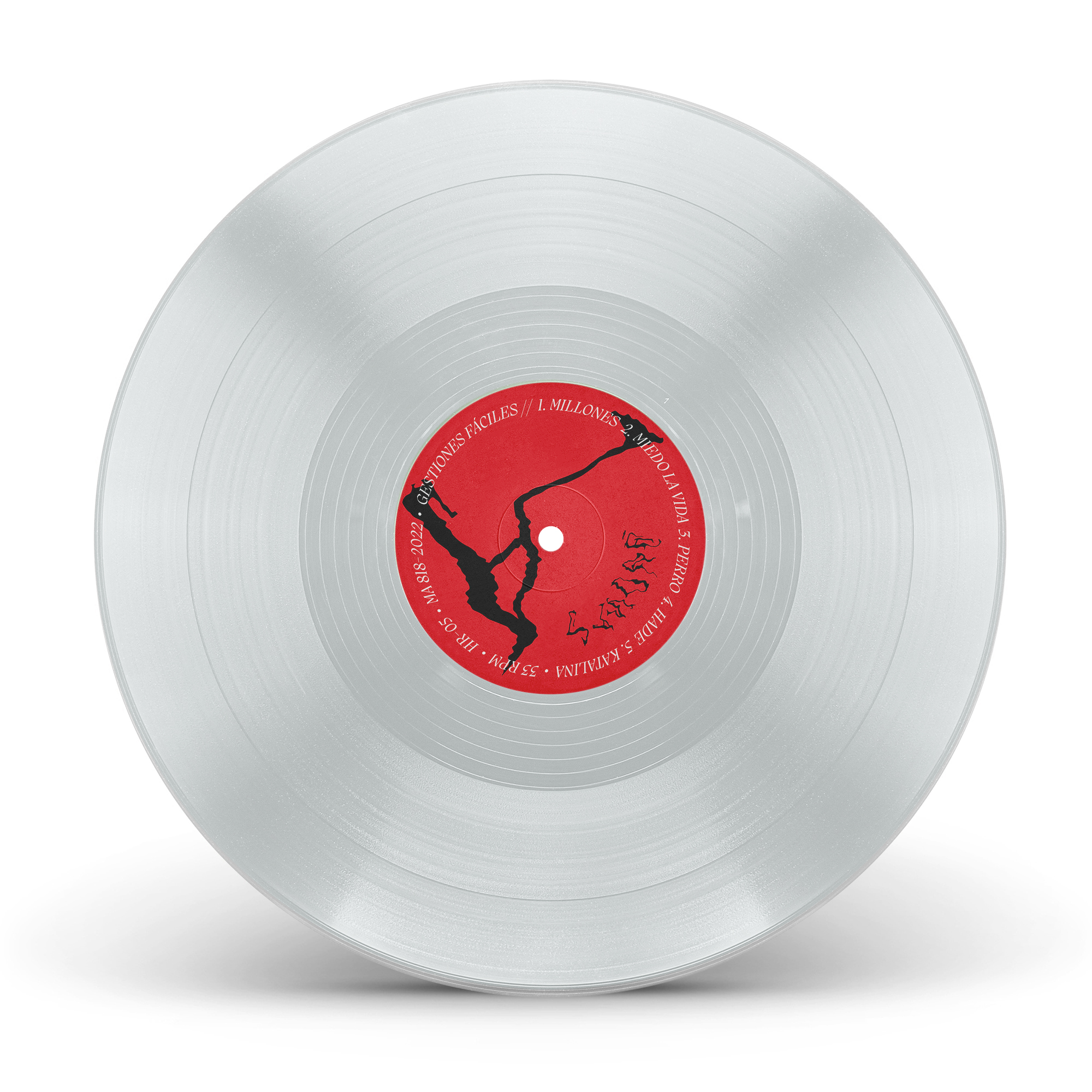
AIDA OSET
Client: Aida Oset — 2023
Label: Hidden Track Records
Photo: Carla Oset
Services: Art Direction | Graphic Design | Vinyl | CD | Singles
We have designed Aida Oset's new album.
Les evasions minimes is a journey of round trip, of fall and ascension. An intimate and personal journey about death and life, about healing, salvation and love. A journey where the voice and the lyrics set the course and where the instrumentation, electronic at times and more organic at others, nuances each of the messages that Aida Oset sends us.
Single
![]()

Vinyl


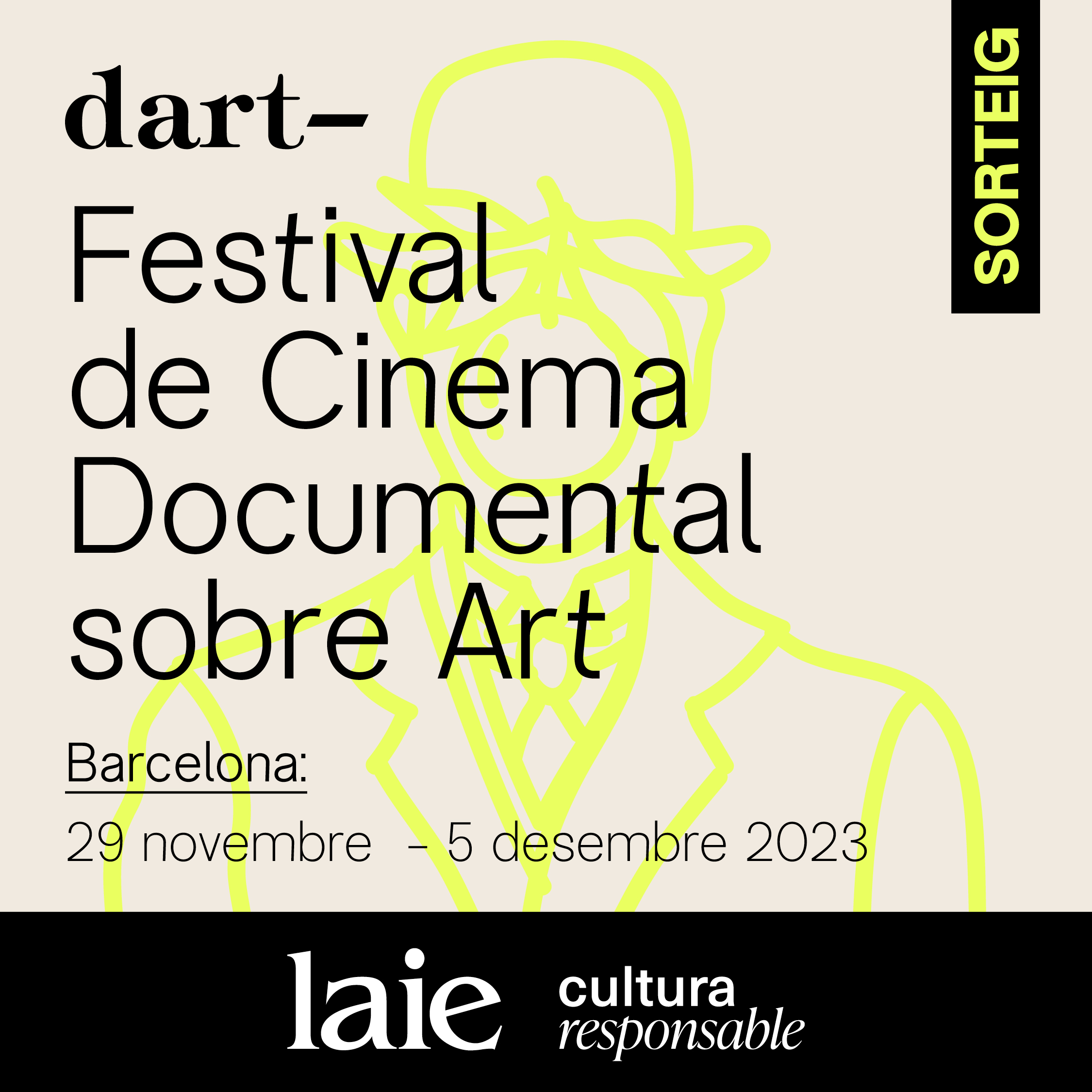
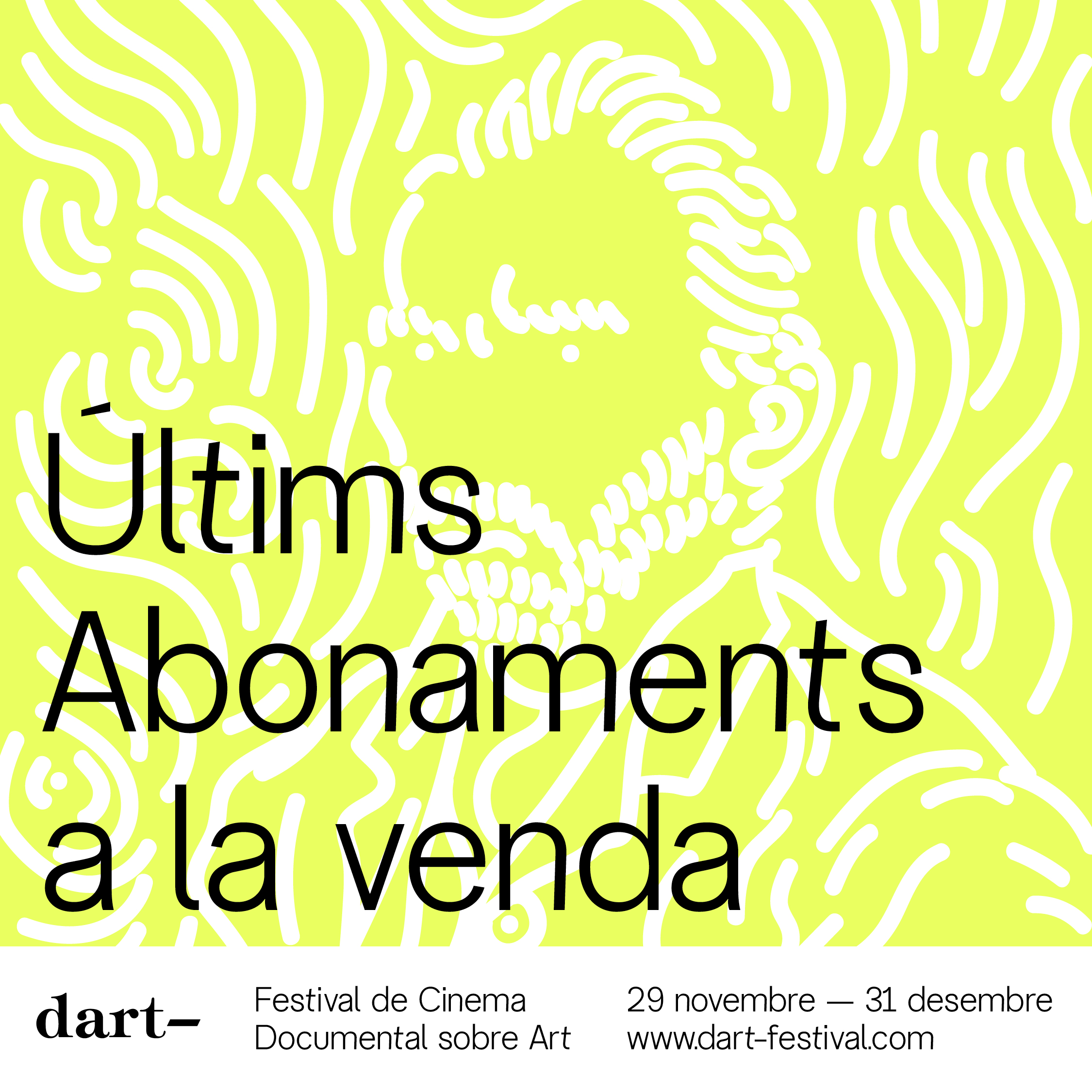
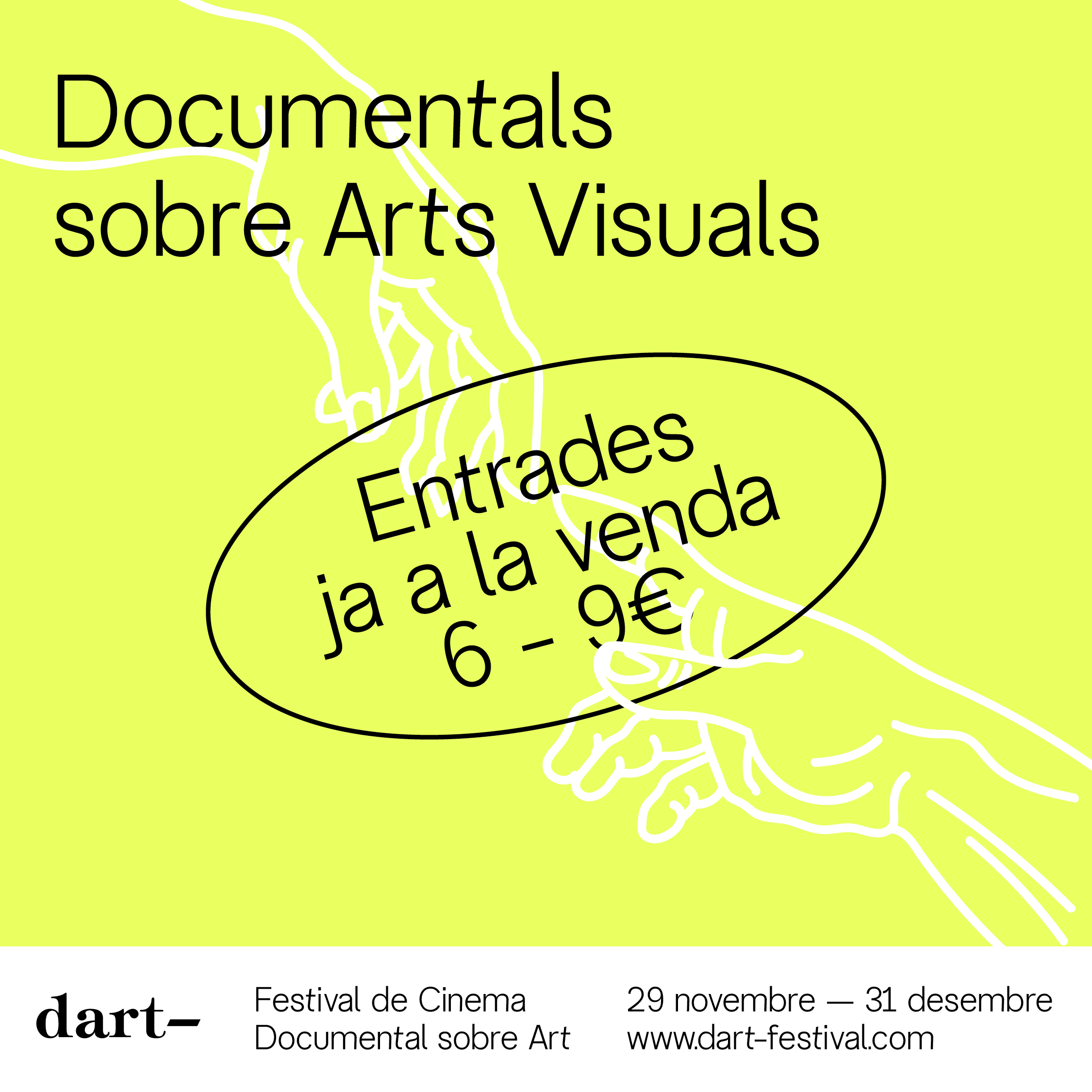
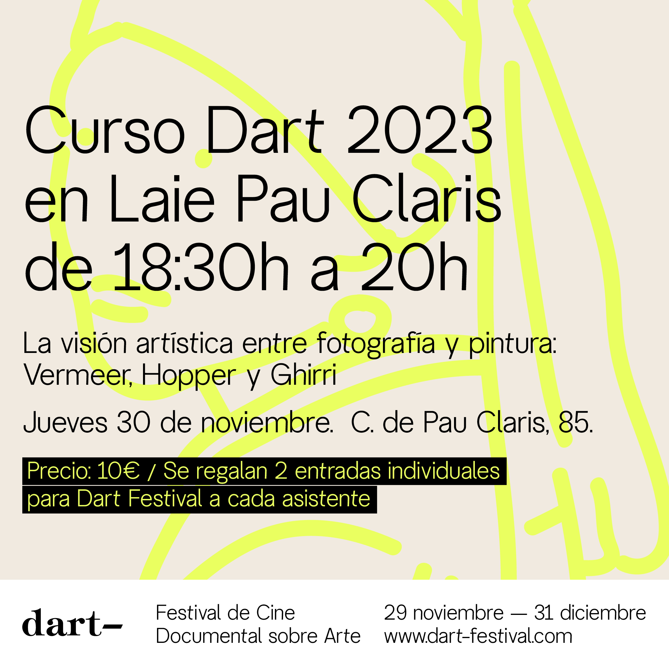
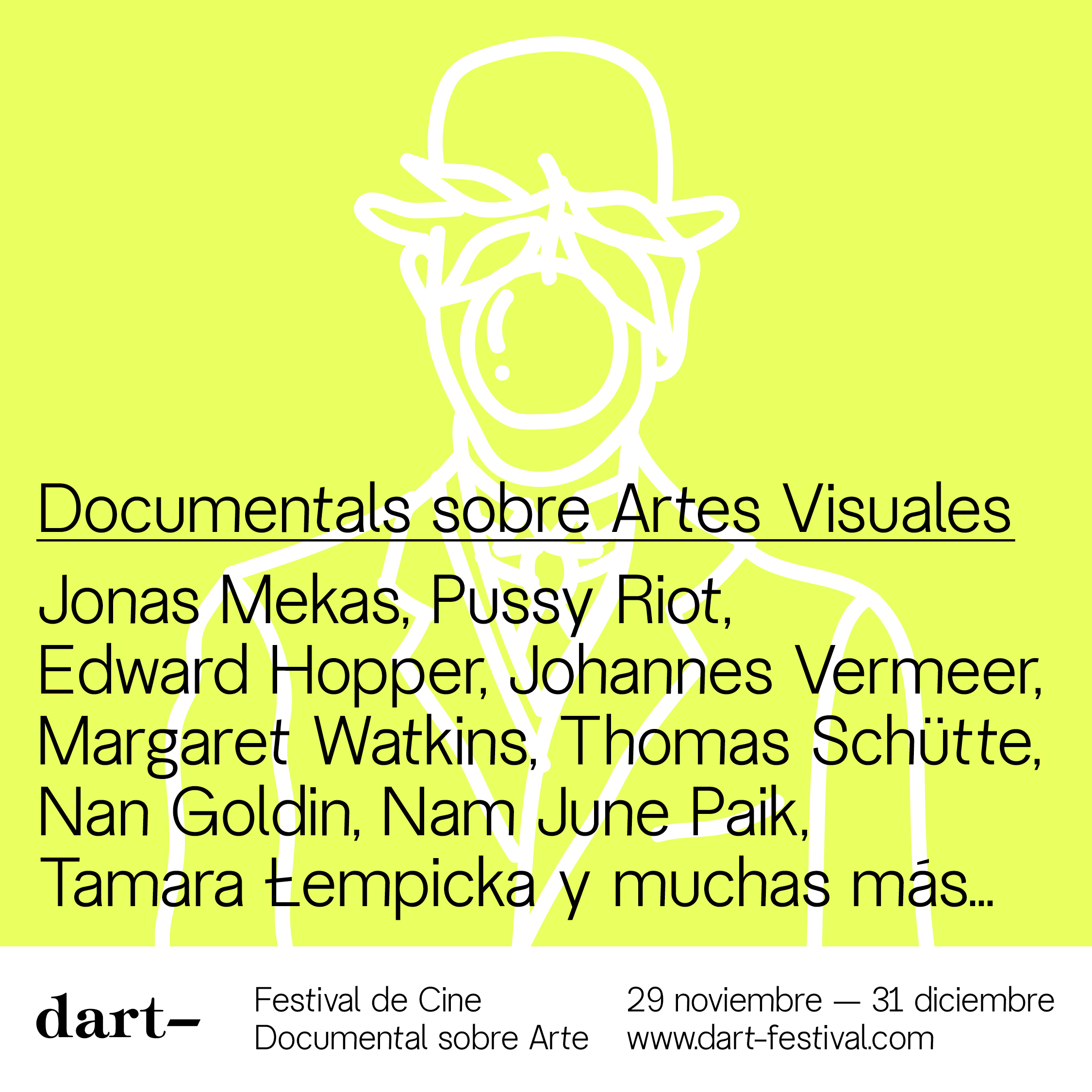
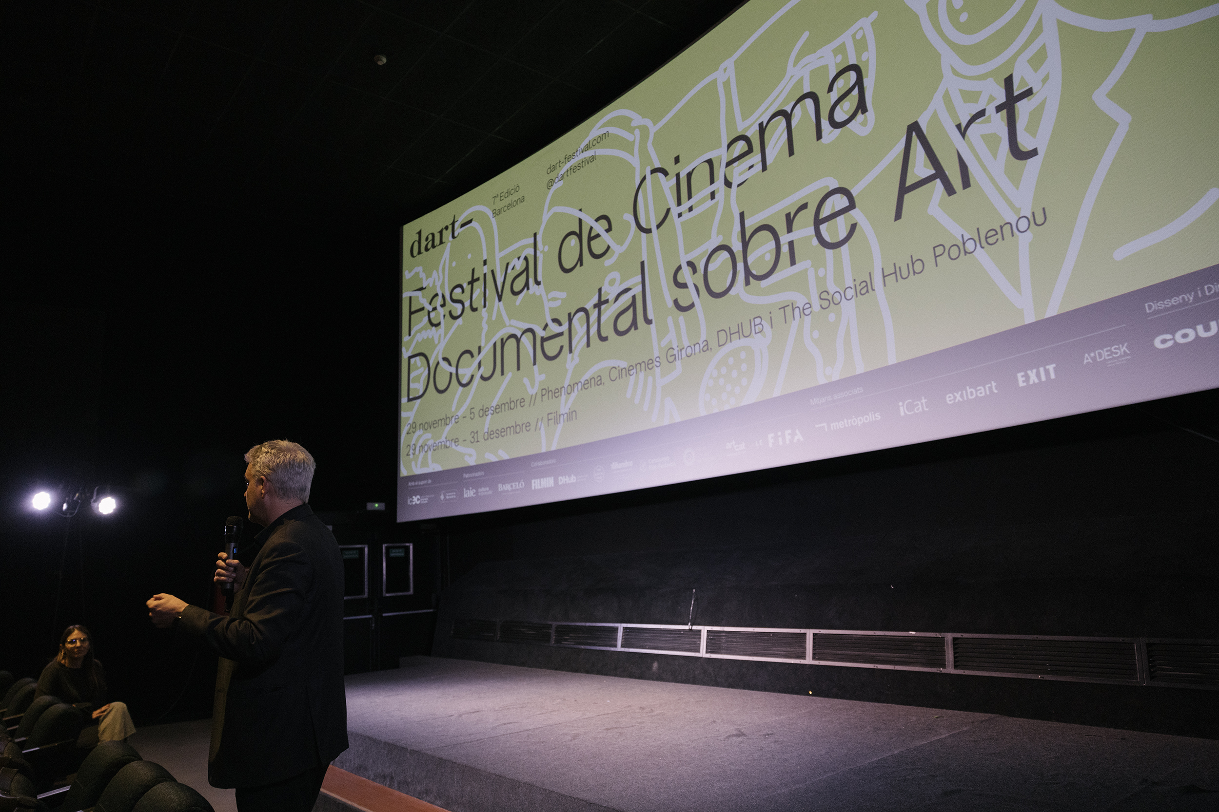
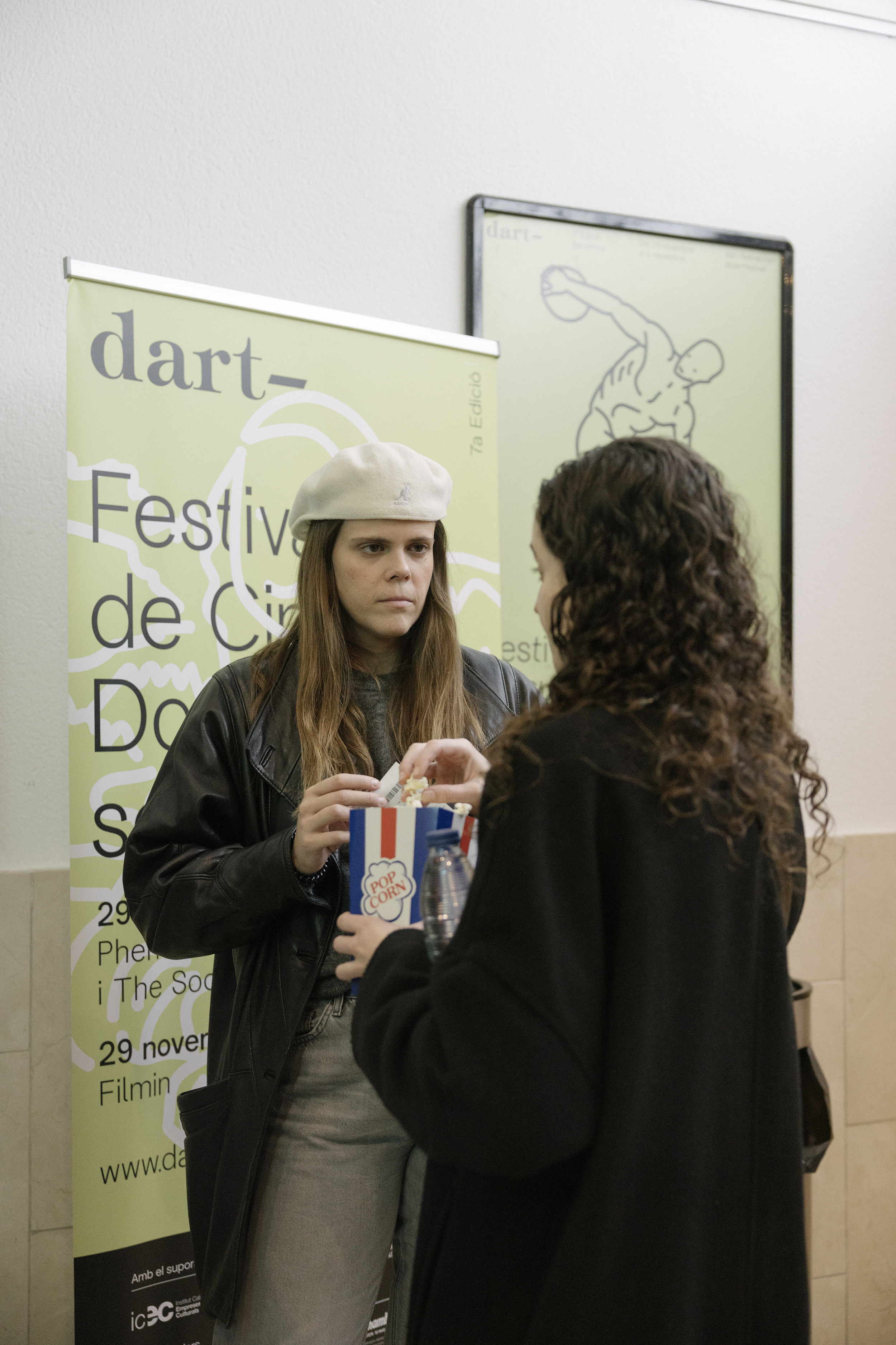
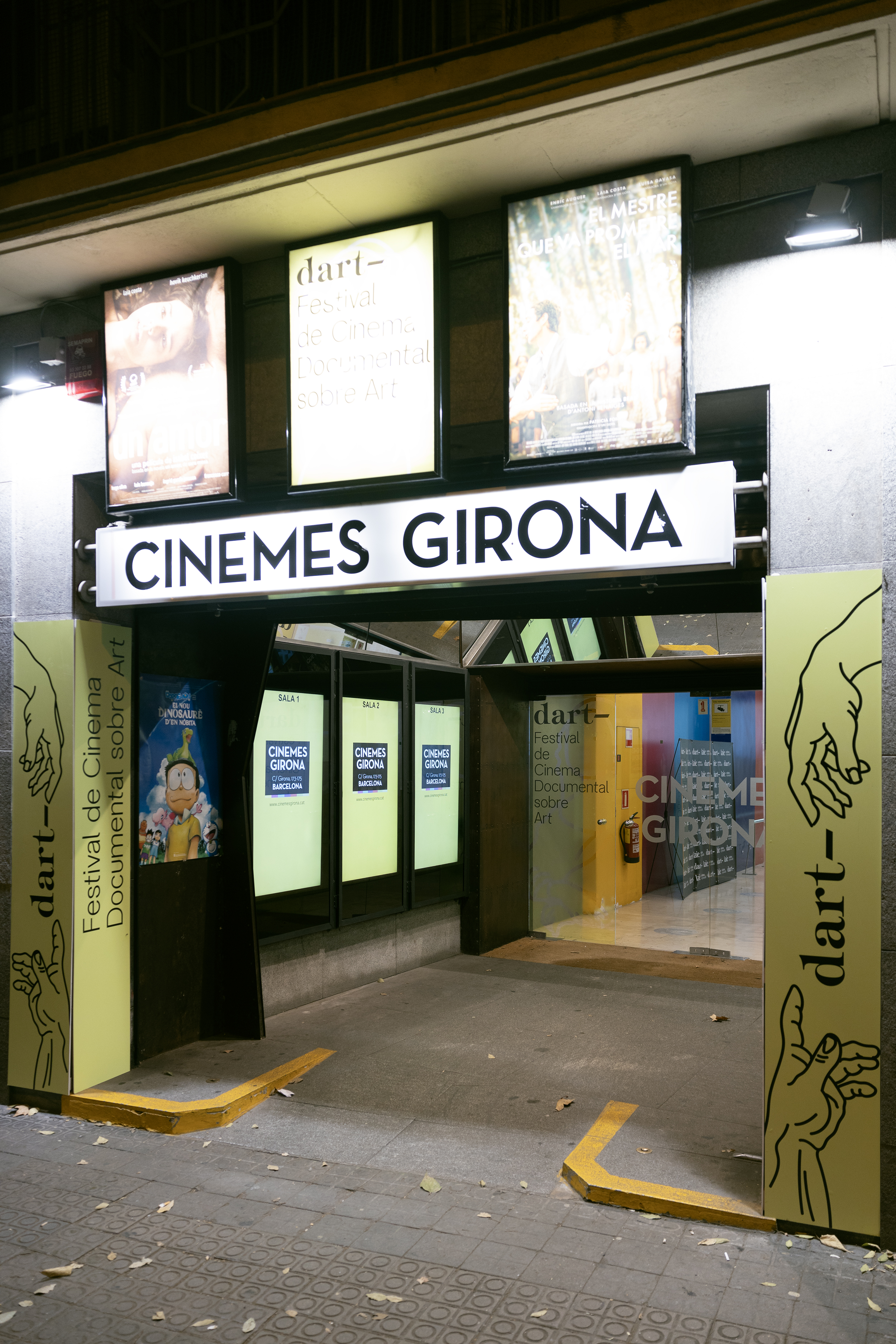
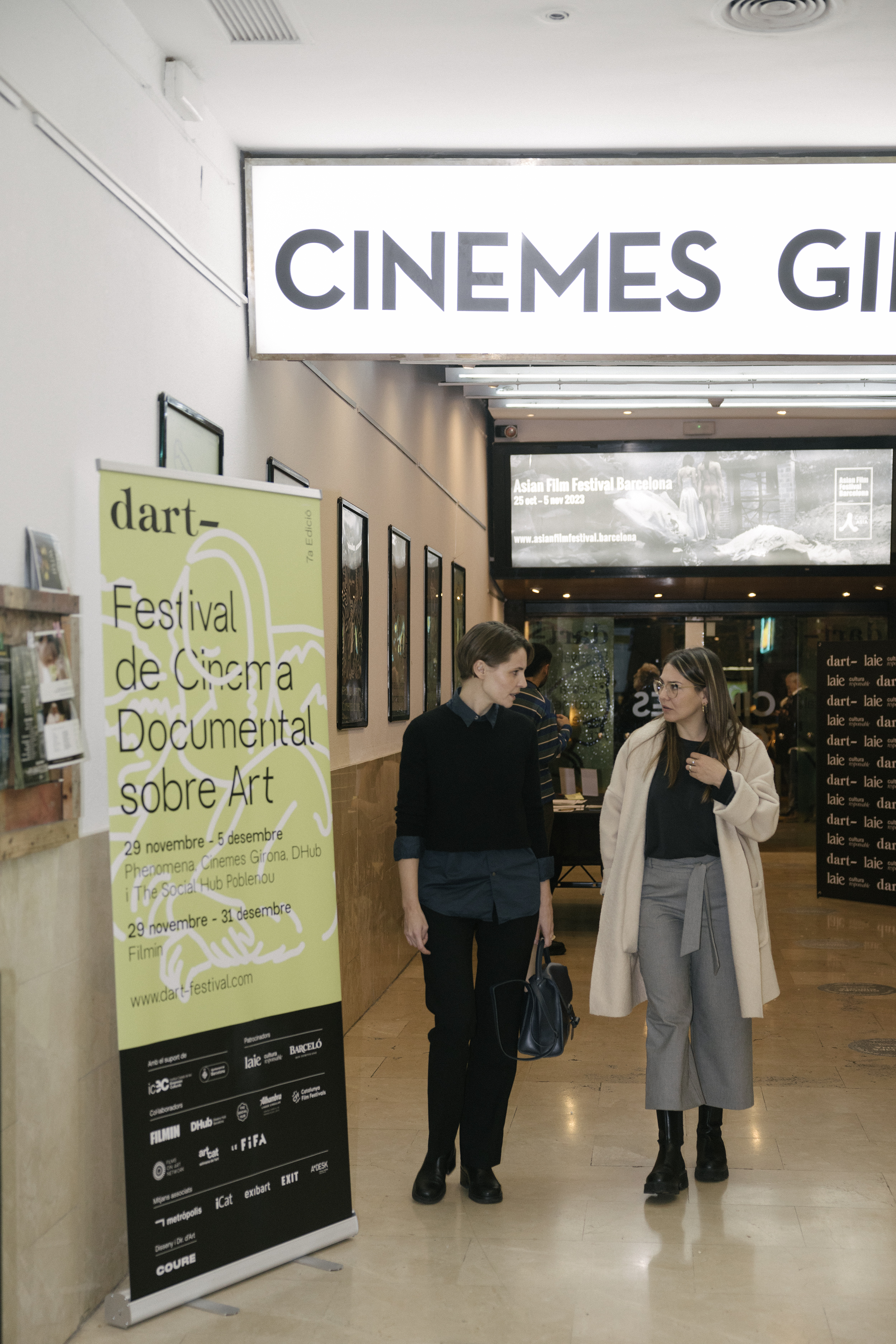
Dart Festival 2023
Client: Dart — 2023Services: Logo | Concept | Festival | Identity | Art Direction | Graphic Design | Social Media | Illustration
Once again, we art directed and produced the graphic campaign of the 7th edition of Dart Festival.


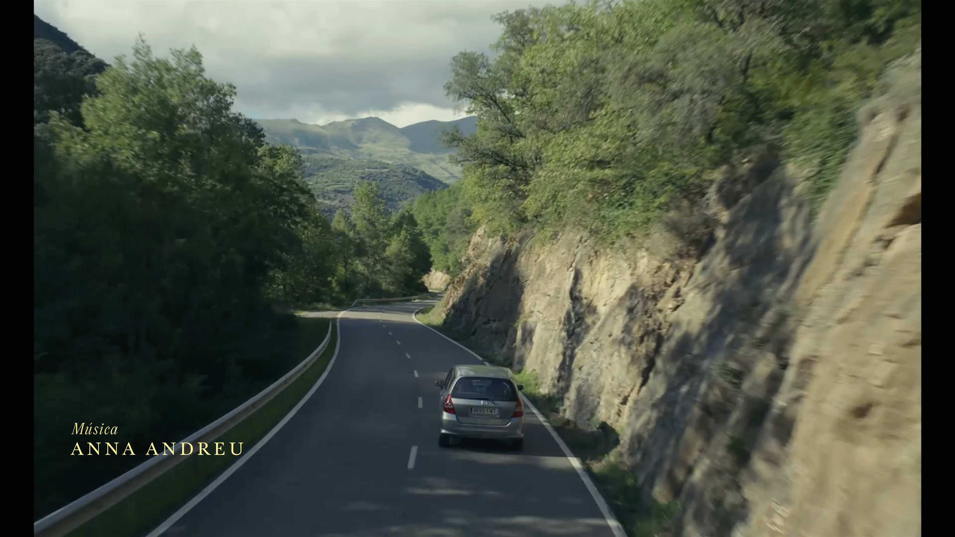
ELS ENCANTATS
Client: COMING SOON FILMS / A Contracorriente Films — 2023
Services: Credits & Poster Design
Poster and credits design for the film “ELS ENCANTATS” by Elena Trapé.
COURE collaborated with Elena Trapé creating the credits and poster for the film “ELS ENCANTATS”. We have linked the design with the formal and conceptual aspects of the film (simplicity, minimalism, introspection and elegance).


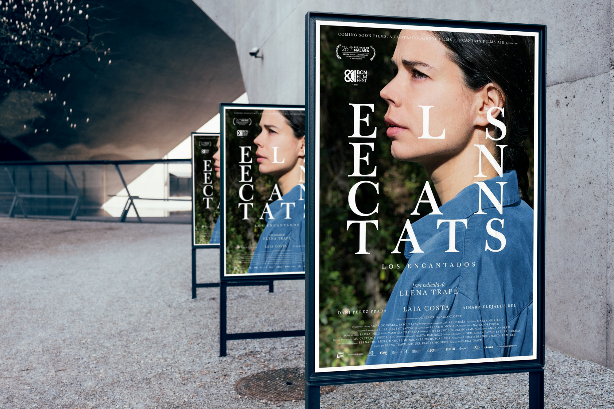


Director Poster

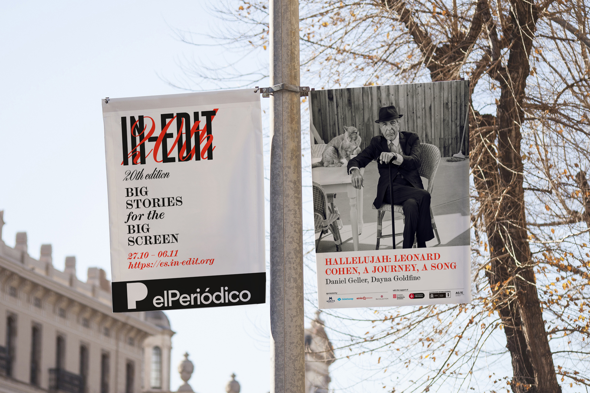
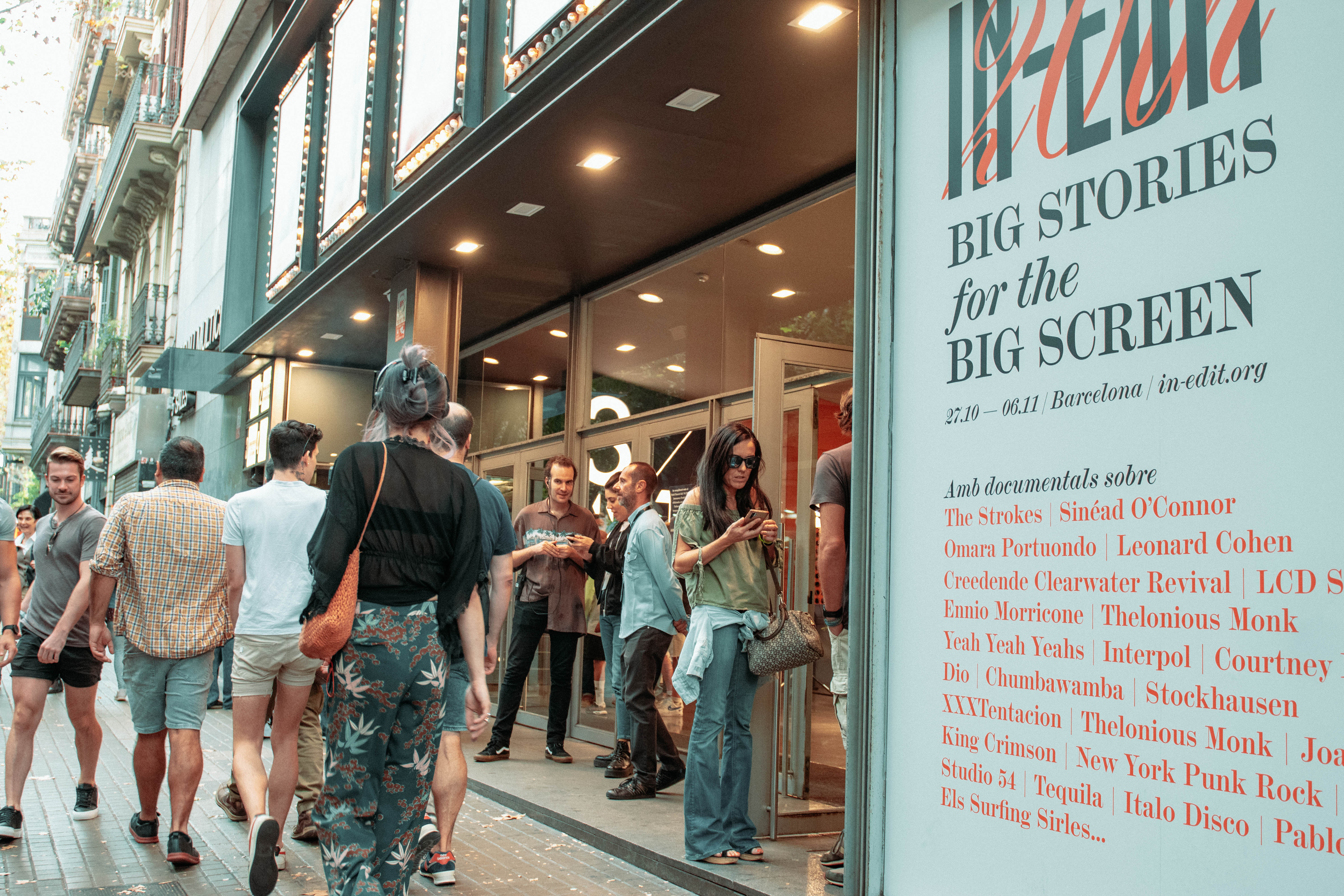
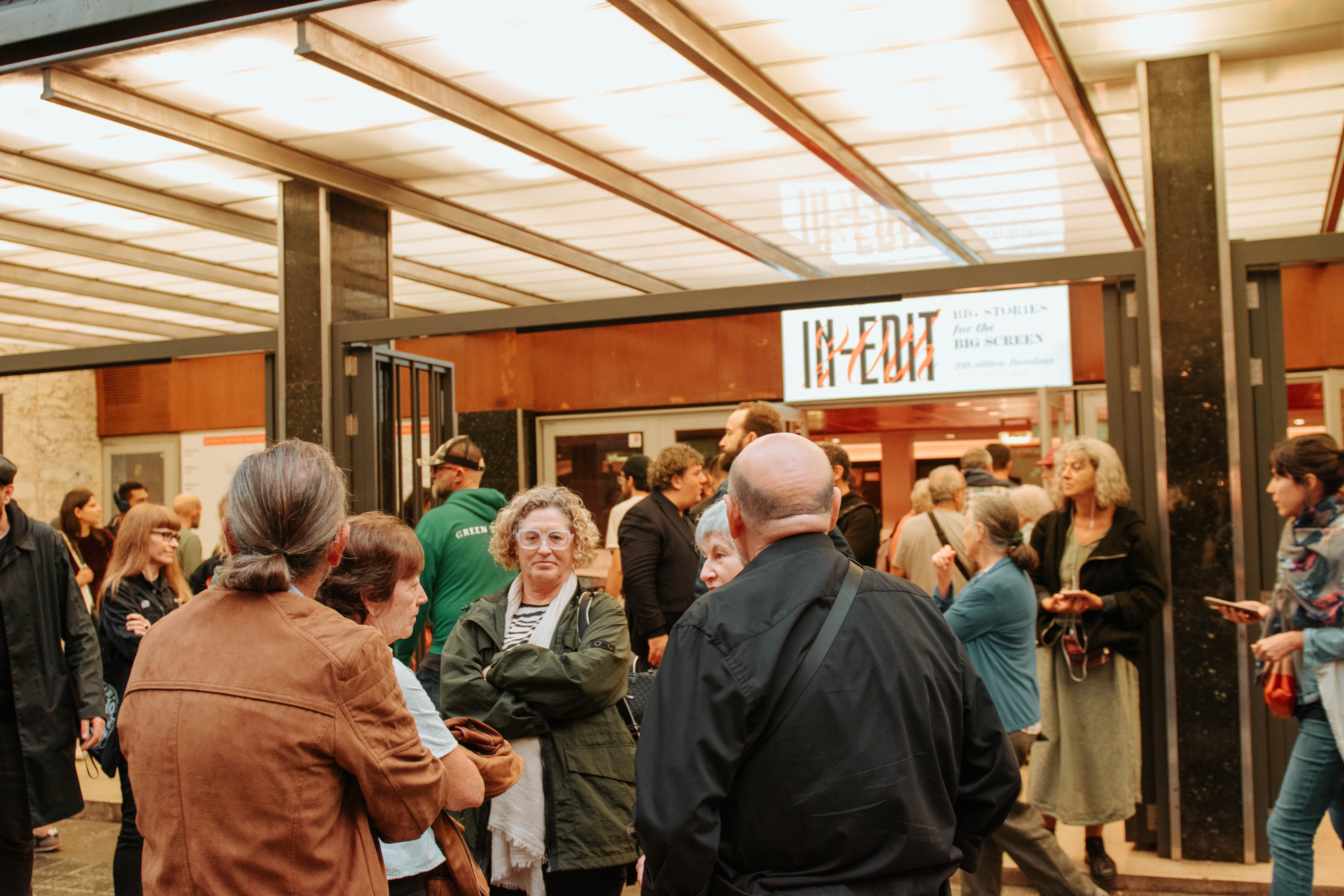
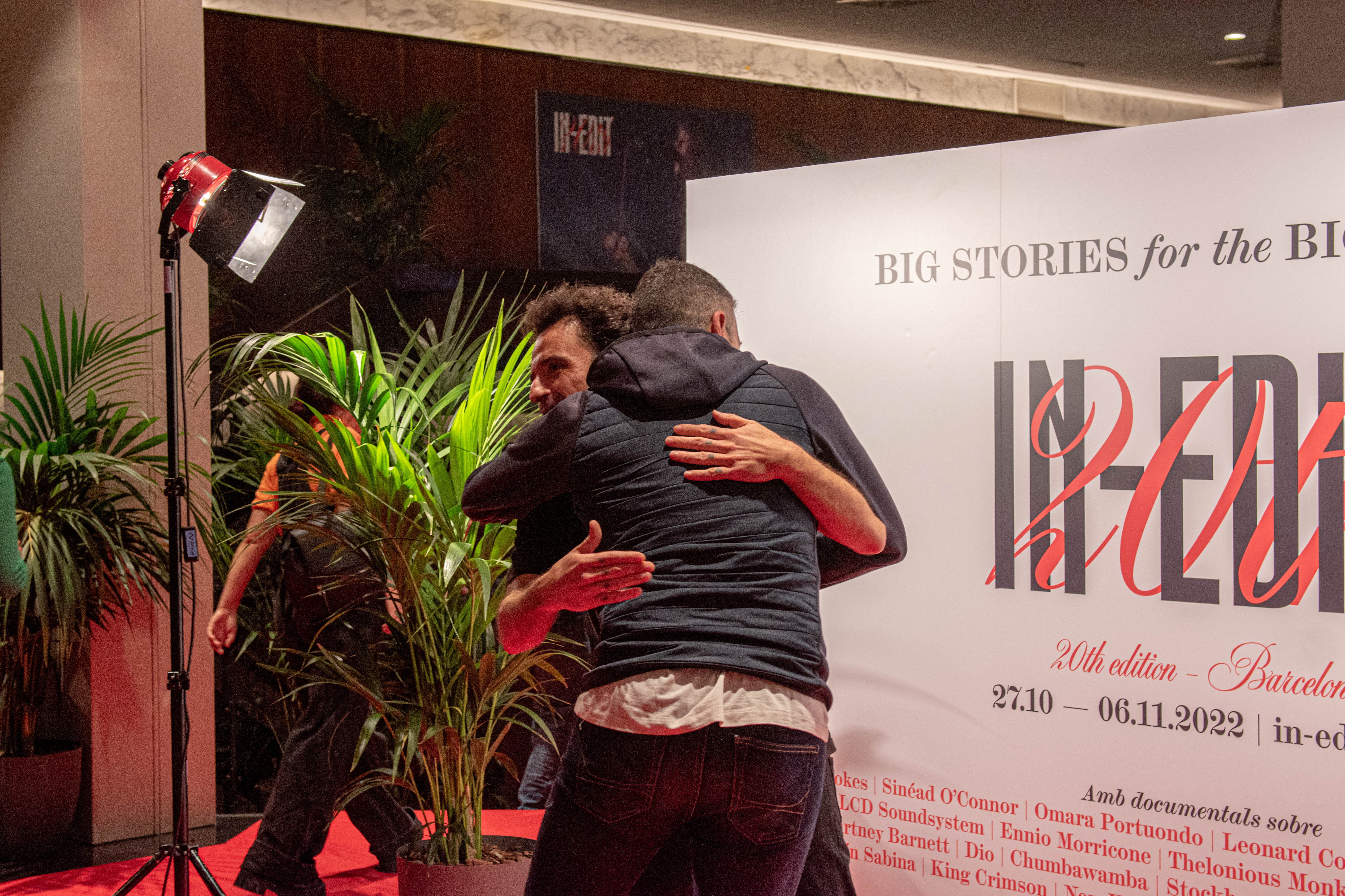
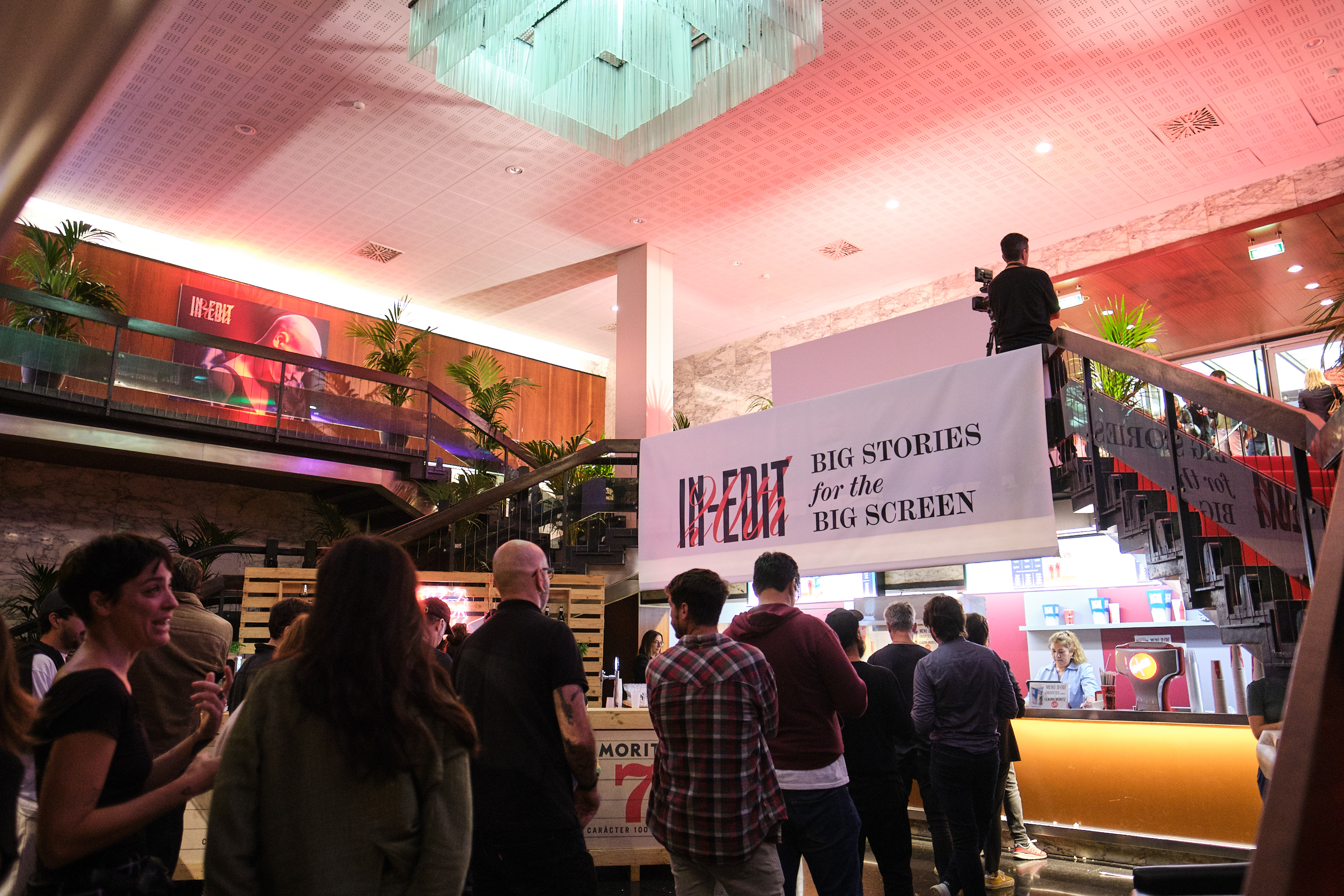
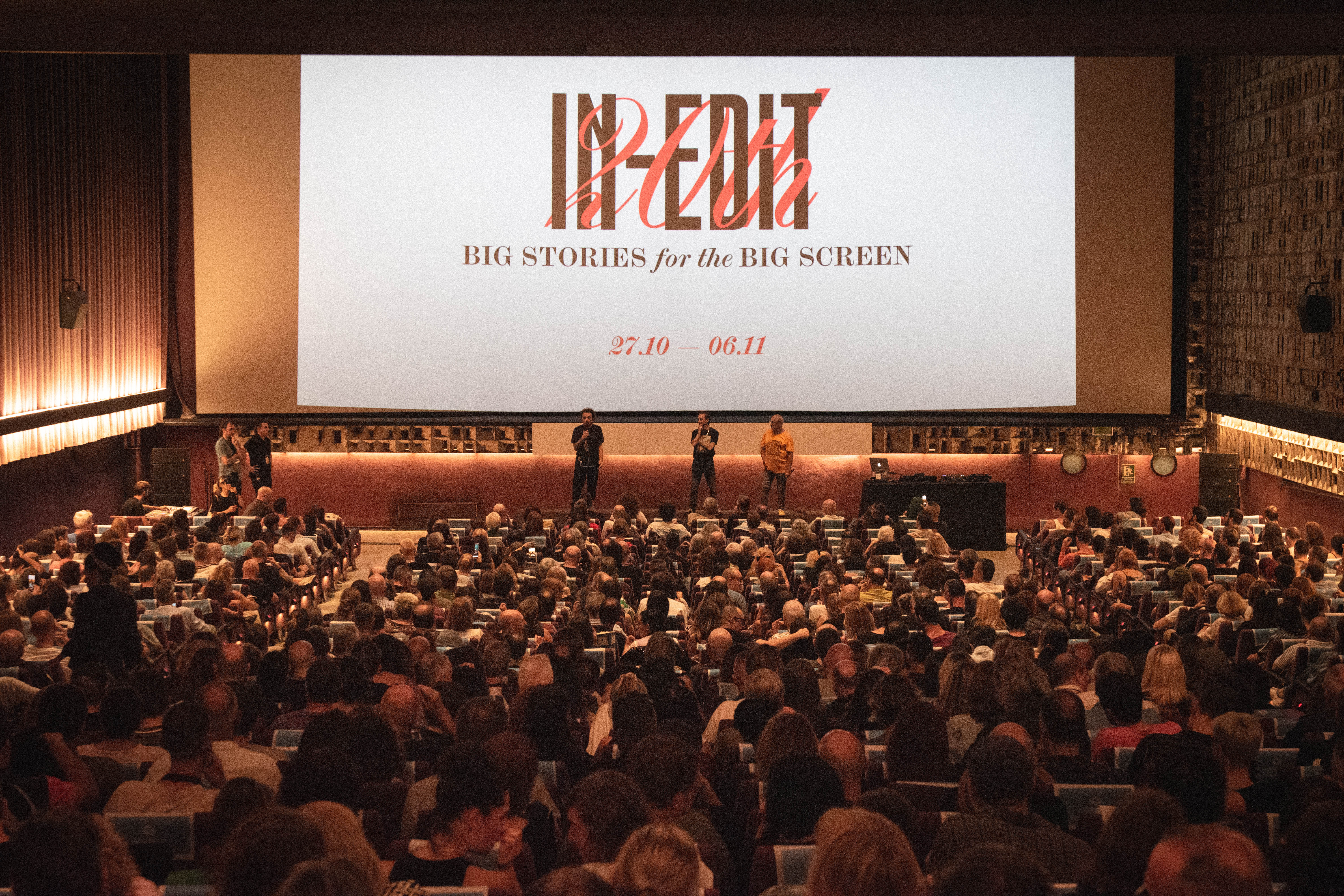
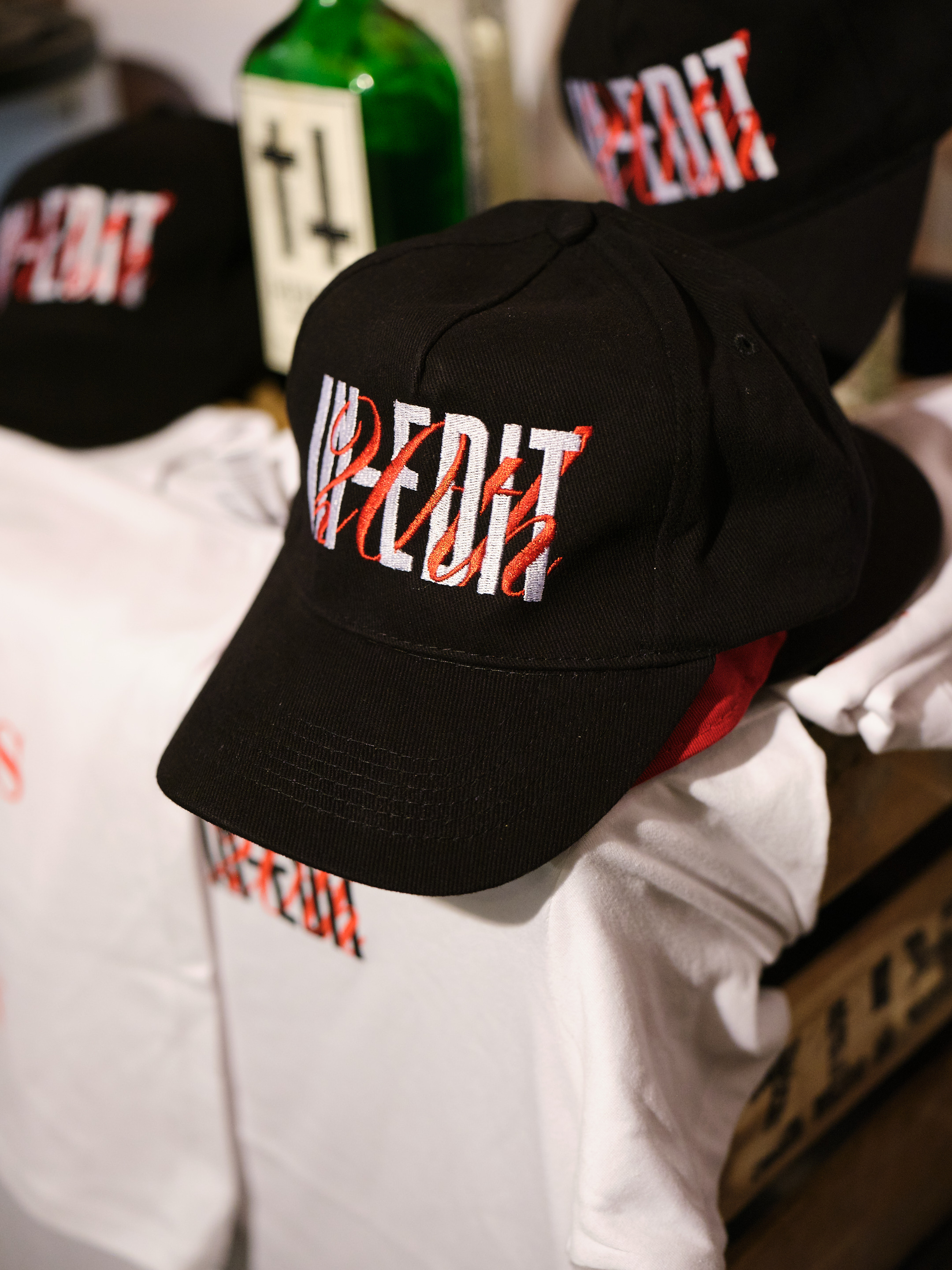
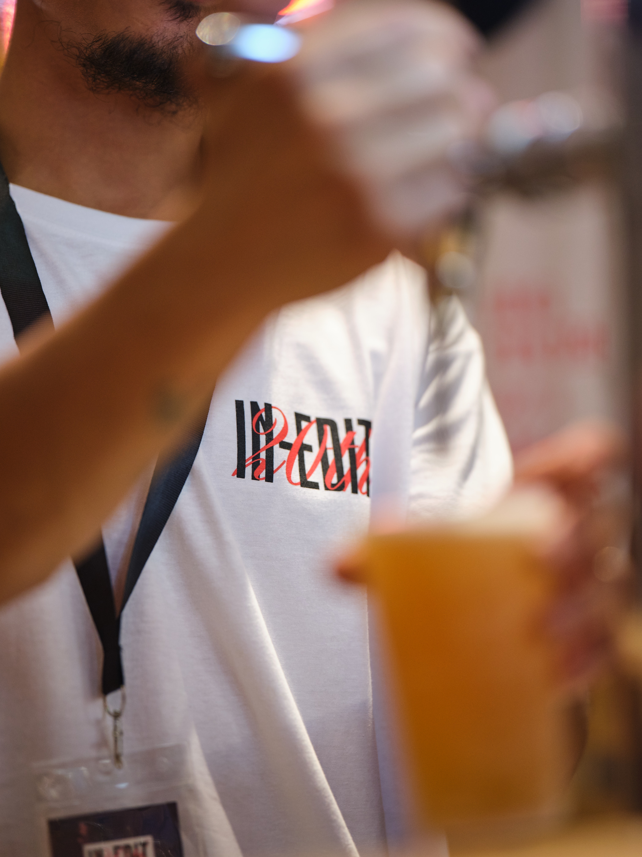
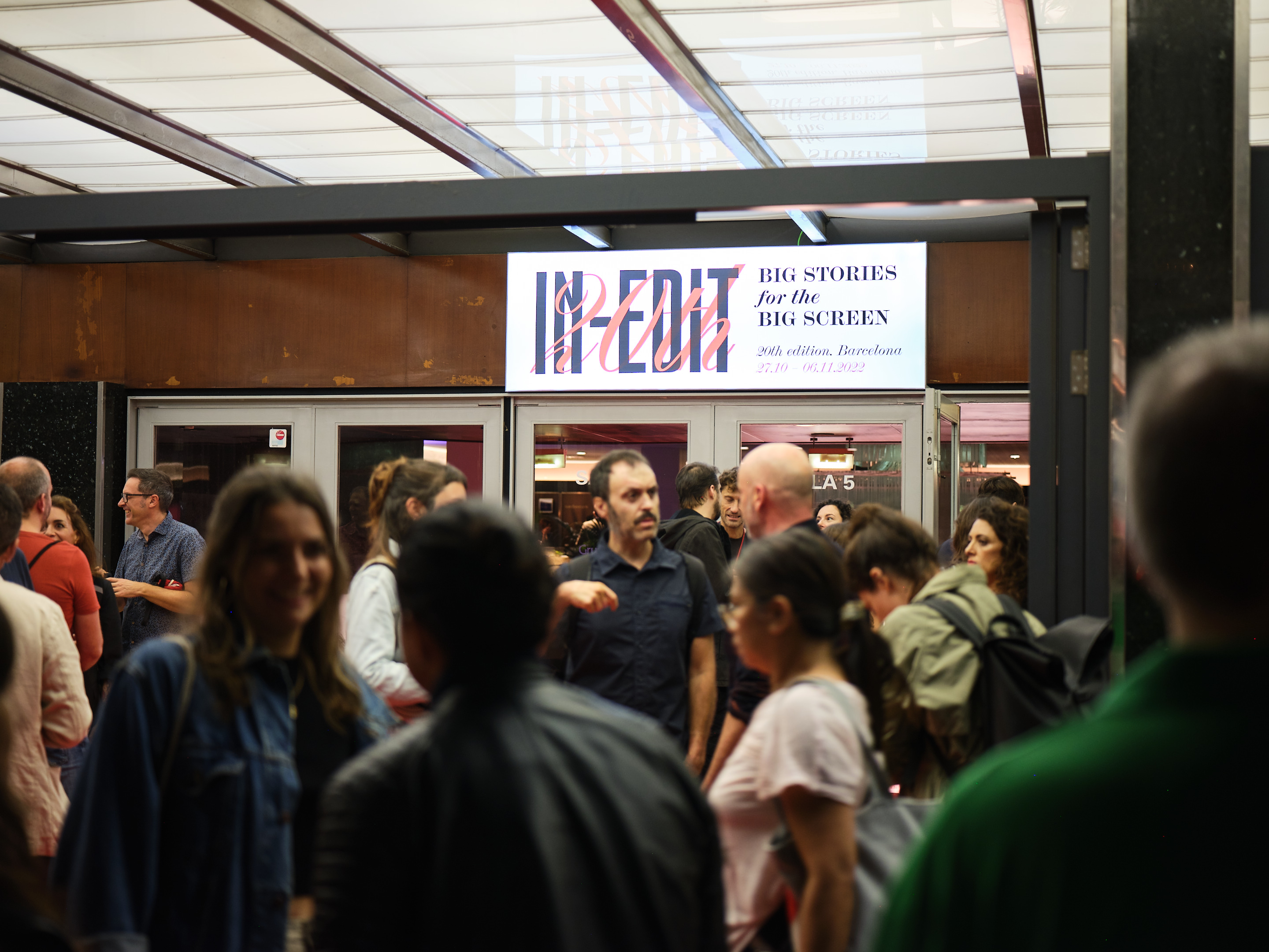
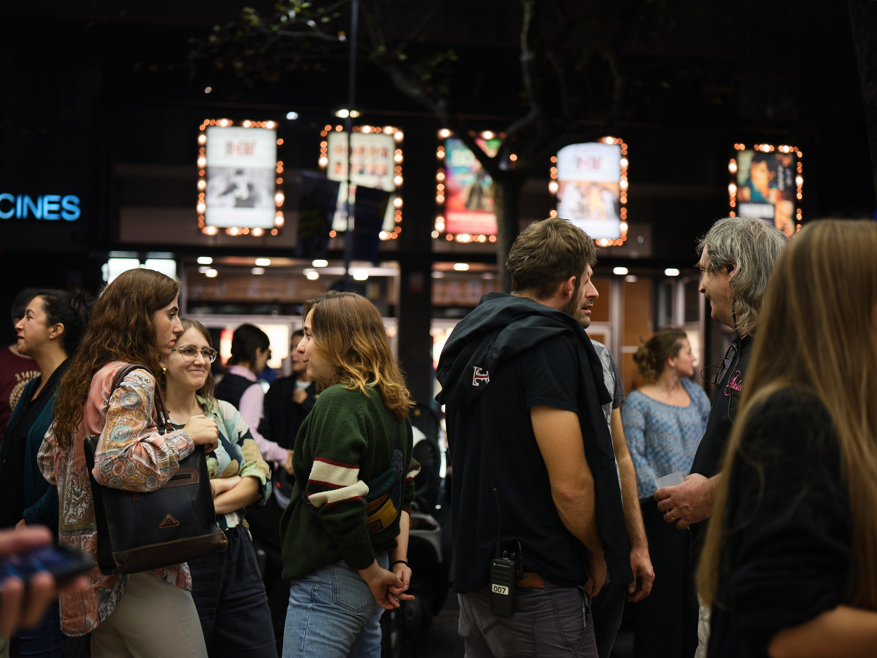
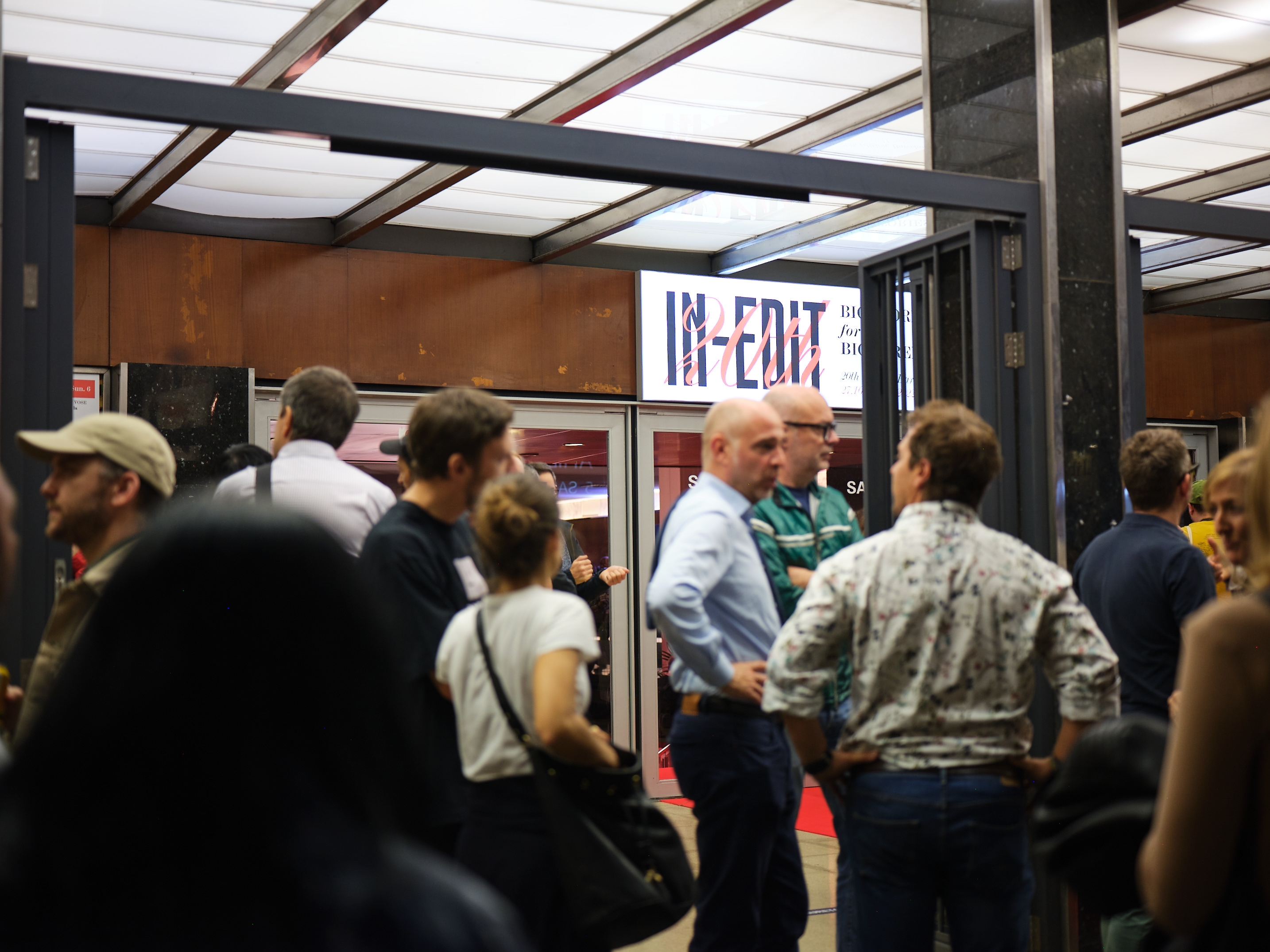
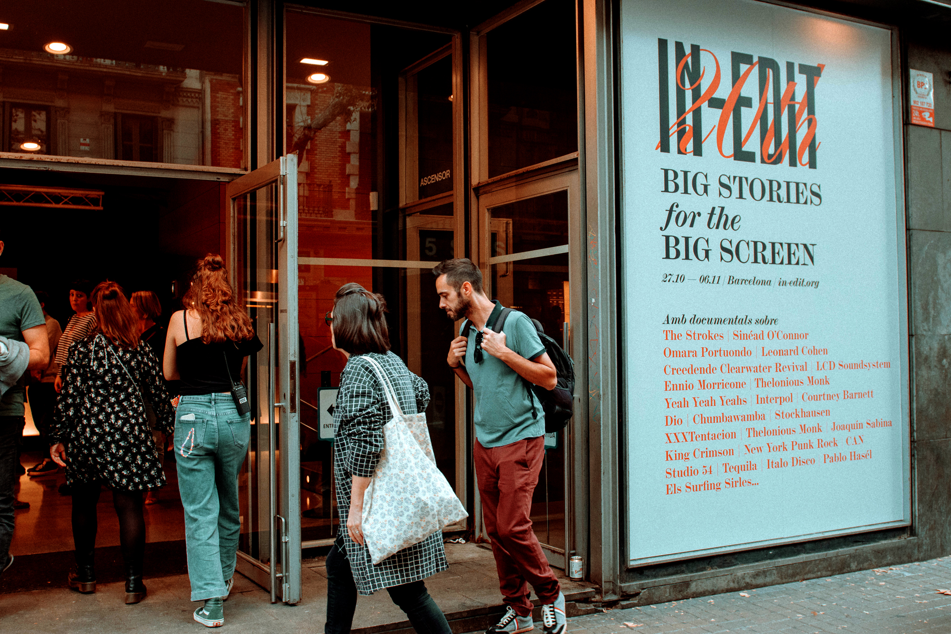
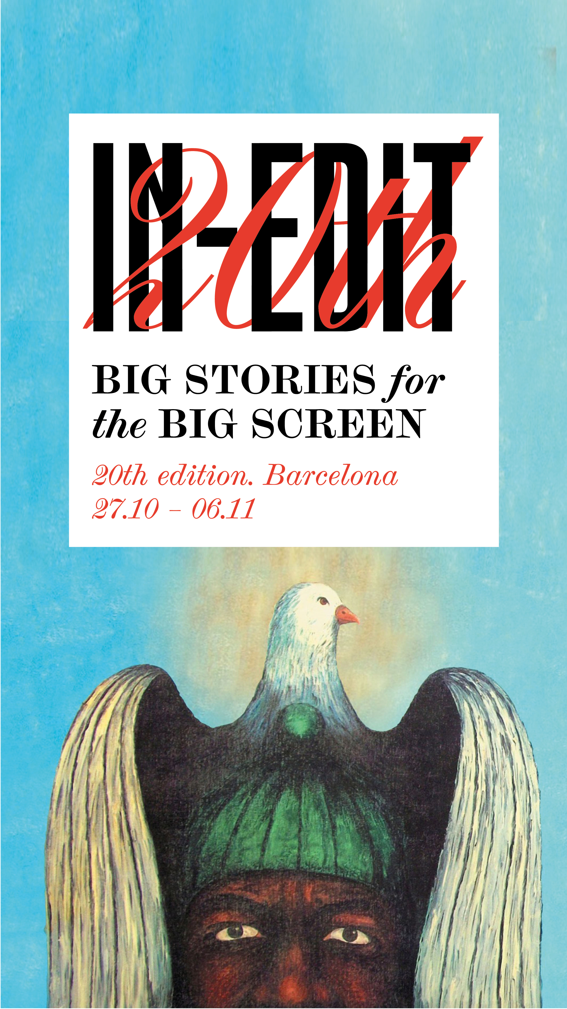
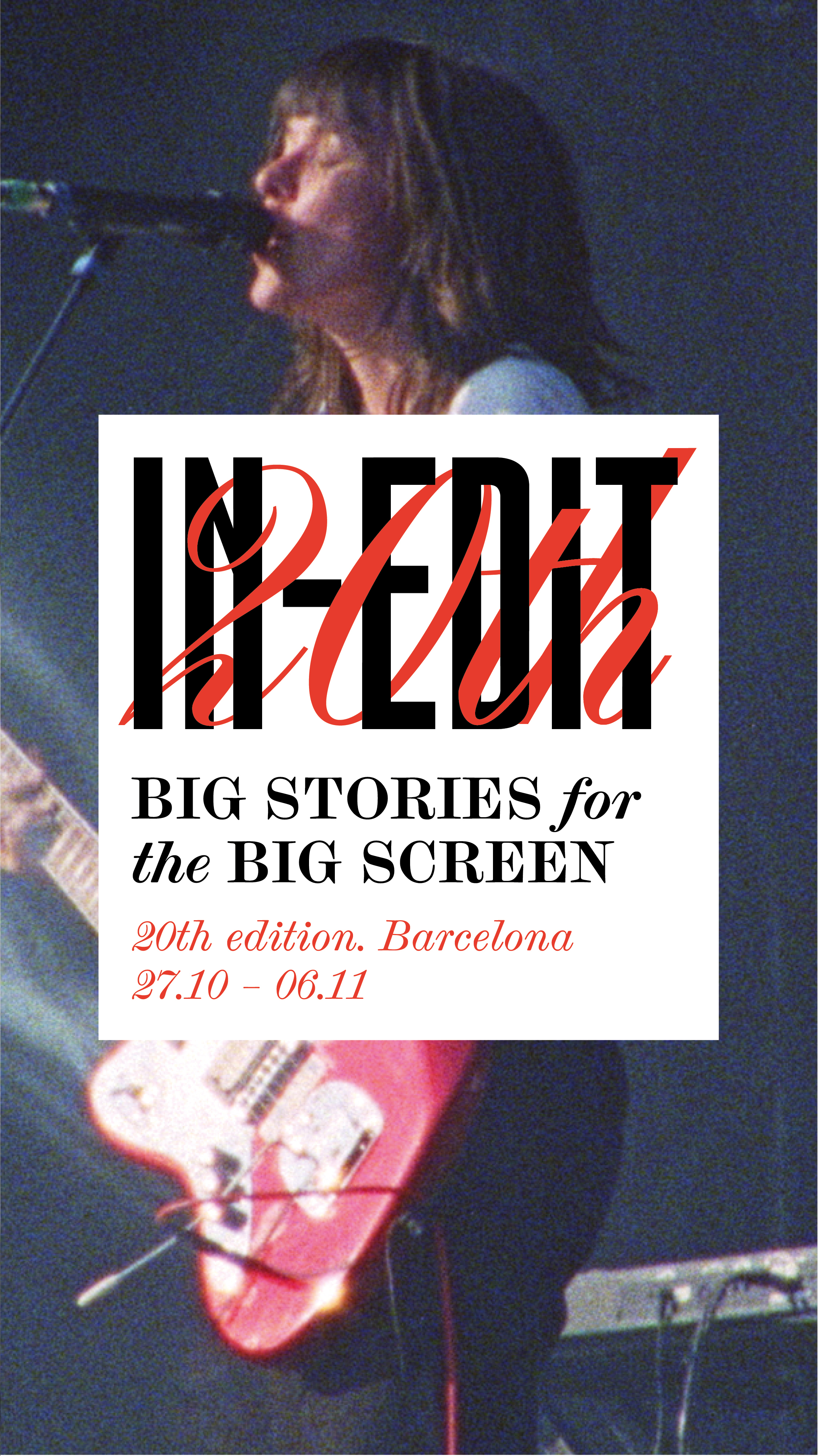
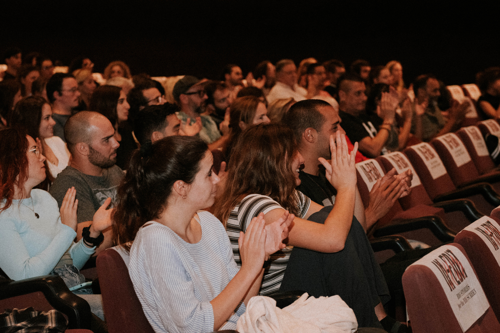
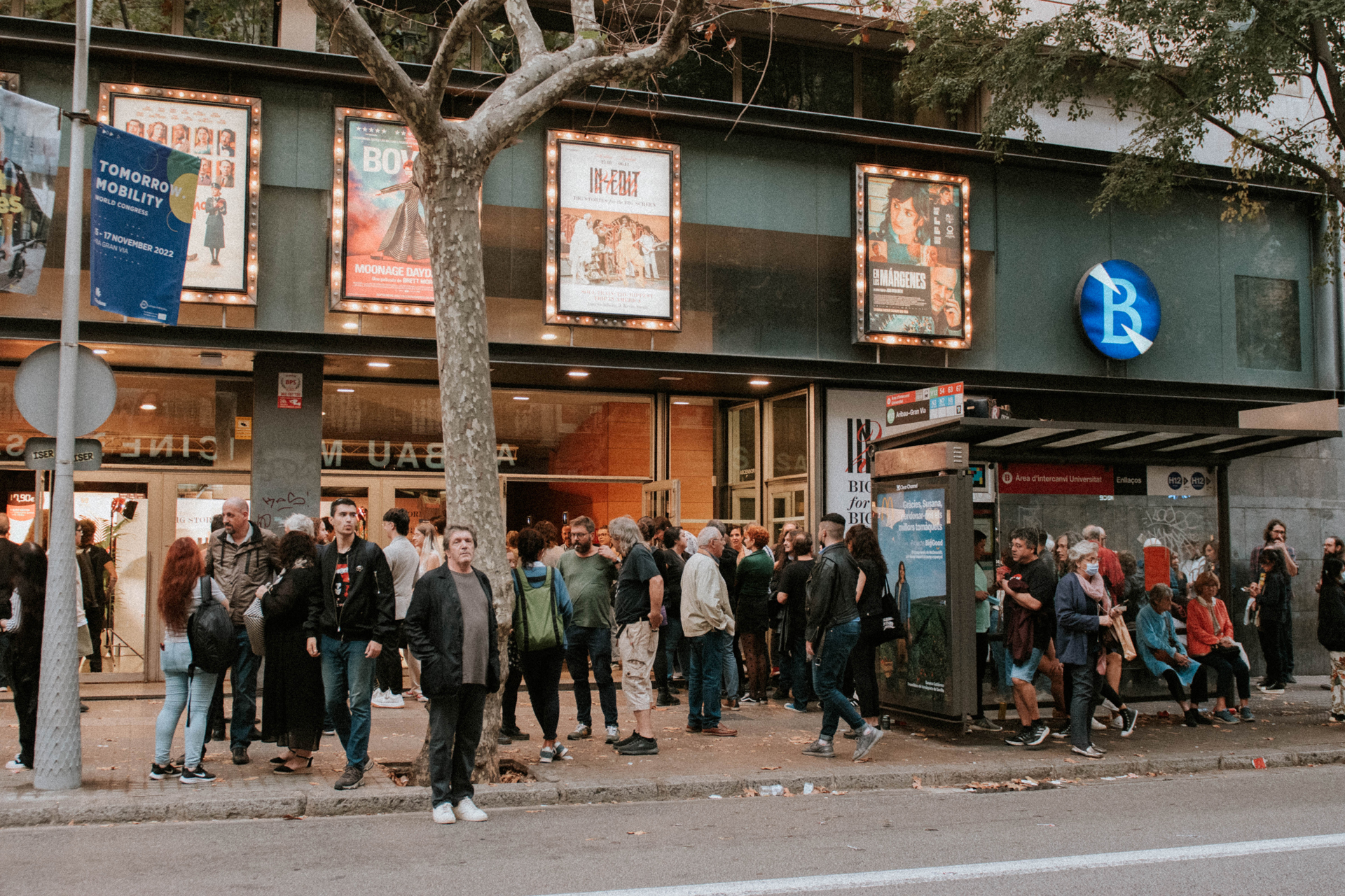
IN-EDIT 2022
Client: IN-EDIT — 2022Services: Rebranding | Signage | Preproduction | Graphic Design | Social Media | Merchandising | Motion Printing studio (merchandising): L’Anacrònica
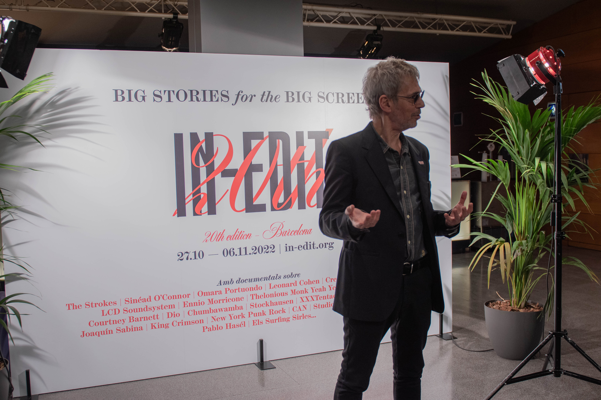
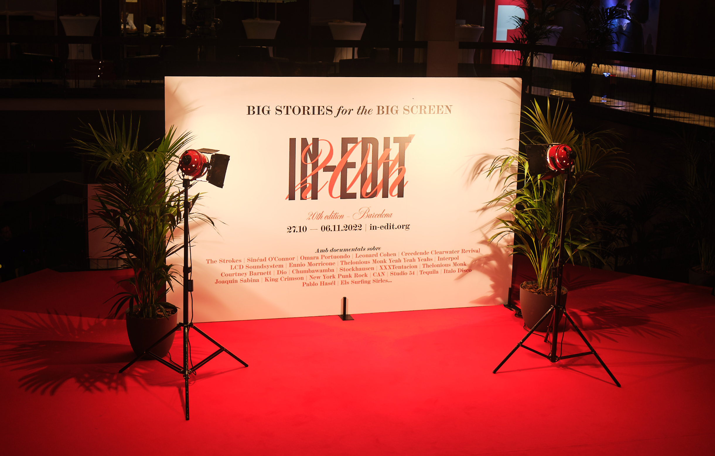
We have been in charge of the signage and rebranding for the 20th edition of our favorite Barcelona Music Documentary Festival.
We had the pleasure of rebranding this emblematic city festival for its 20th anniversary. We have created a logo that updates the brand and, at the same time, emphasizes the commemoration of the 20 years by weaving together the 20th with the lettering. This and the use of the Scotch Modern typeface provide an elegant and vintage look reminiscent of classic film premieres.
We have kept the original colors (white, red, and black), which are an unmistakable trademark of the house, and have maintained the original spirit of the festival.
For the cinema, we have chosen decorations that fit this classic look. We have placed red carpet throughout the main cinema hall, plants all over the place, spotlights, and catenaries with red cord.